Good contributions don't always come from your job title.
During a high-pressure sprint, the team needed onboarding screens for the App Store. As a marketing assistant, I took the initiative to support our lead designer by conceptualising the initial visuals. This wasn't my official role, but I saw an opportunity to contribute and learn.
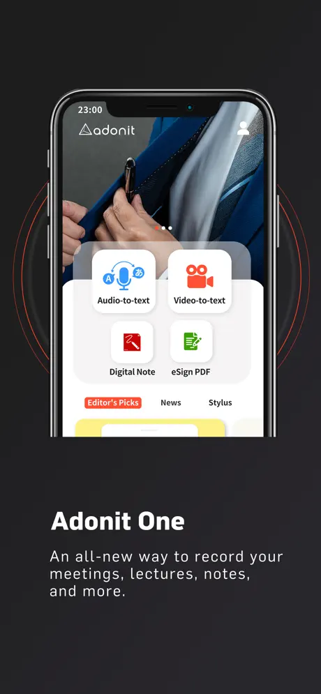
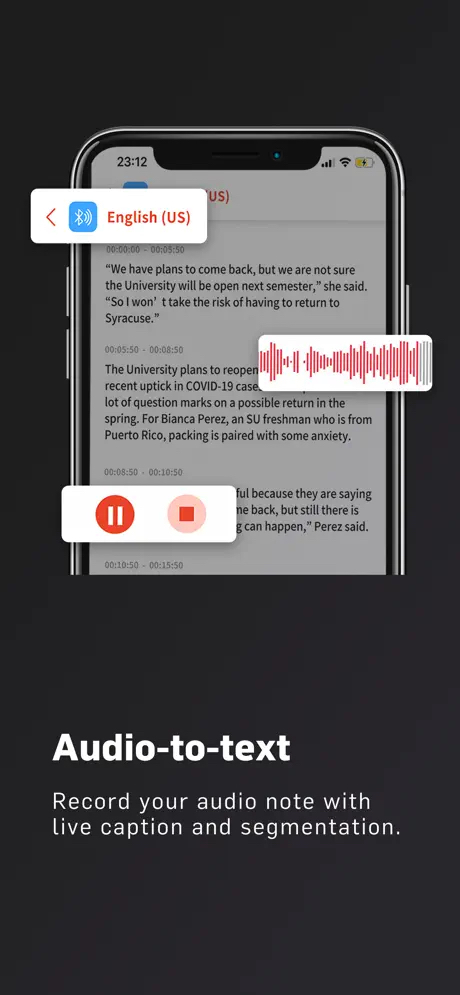
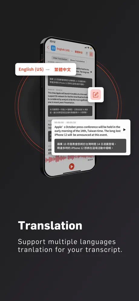
I studied common UI patterns in App Store onboarding to understand what works, then translated those patterns into concepts for the main page, audio-to-text, and translation screens.
- Background. Soft gradients or abstract shapes add visual interest without distraction.
- Text. A single headline followed by one or two short lines, or just a bold description.
- Image. The screen is often cropped to two-thirds to enlarge key features, with pull-outs to spotlight them.
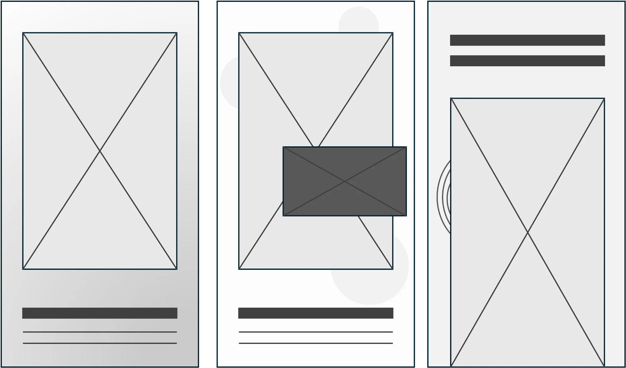
Each screen uses a soft gradient background with circular line accents to add depth while keeping the focus on key interactions. A cropped device frame spotlights featured functions, with core actions, record, pause, translate, edit, visually elevated through pop-out effects. Typography stays minimal and direct, using brand colours for a cohesive, stylus-friendly interface.
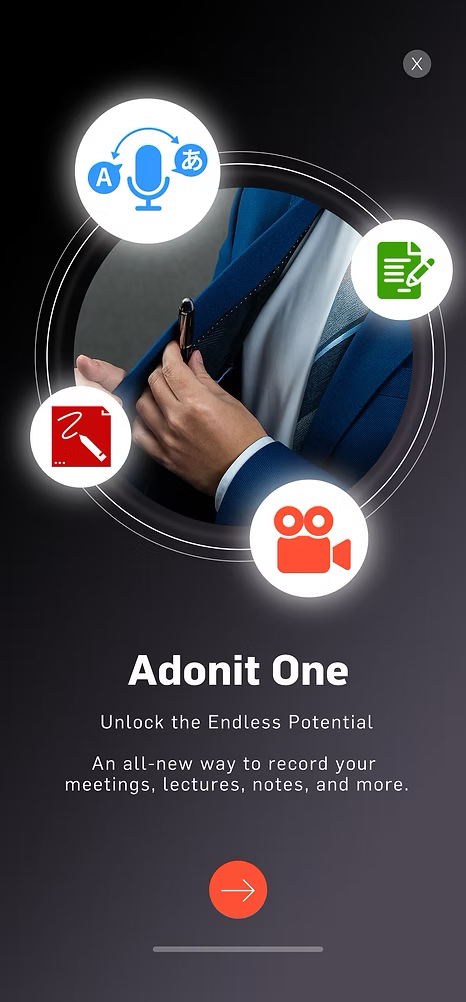
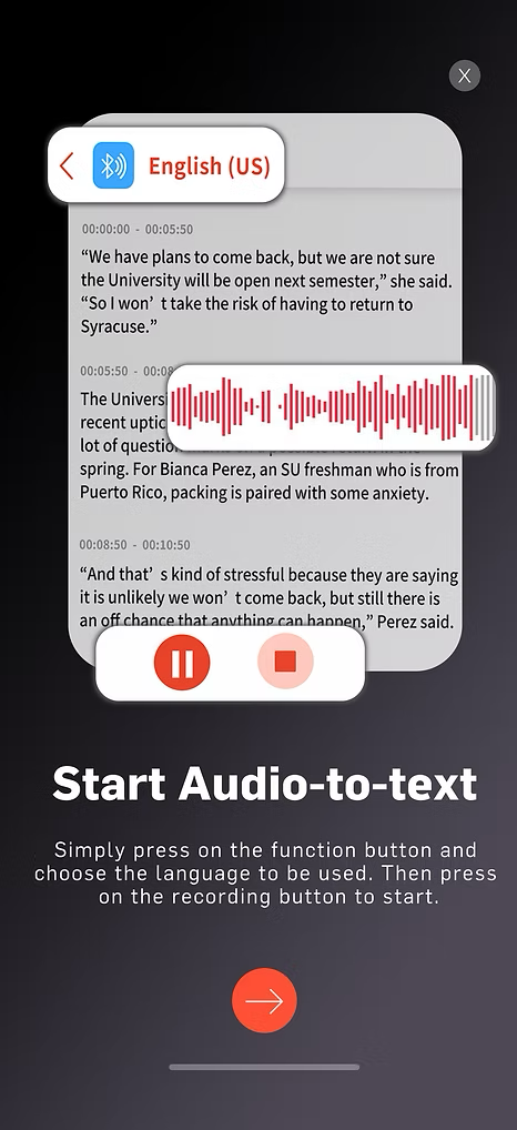
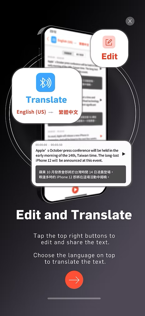
The final visuals were refined by the lead designer with a cleaner layout, full device frames, and a plain dark background accented by red rings, aligning with Adonit's brand colours. The UI elements I highlighted were retained, just integrated into a sleeker, marketing-oriented style.
This project taught me that good contributions don't always come from your job title. By taking initiative and doing the research upfront, I provided concepts that actually influenced the final design.
It also showed me the value of understanding brand guidelines. I wasn't just making something that looked nice, I was making something that fit Adonit's existing visual language. That constraint made the work stronger.