Minimal, and unmistakably for women.
Designed in January 2021, the set followed a clear client brief: keep it minimal, and lean on a pink palette so the brand reads as female-friendly from the first glance. The challenge with minimalism is that there's nowhere to hide, so the work went into spacing, type and one confident colour rather than decoration.
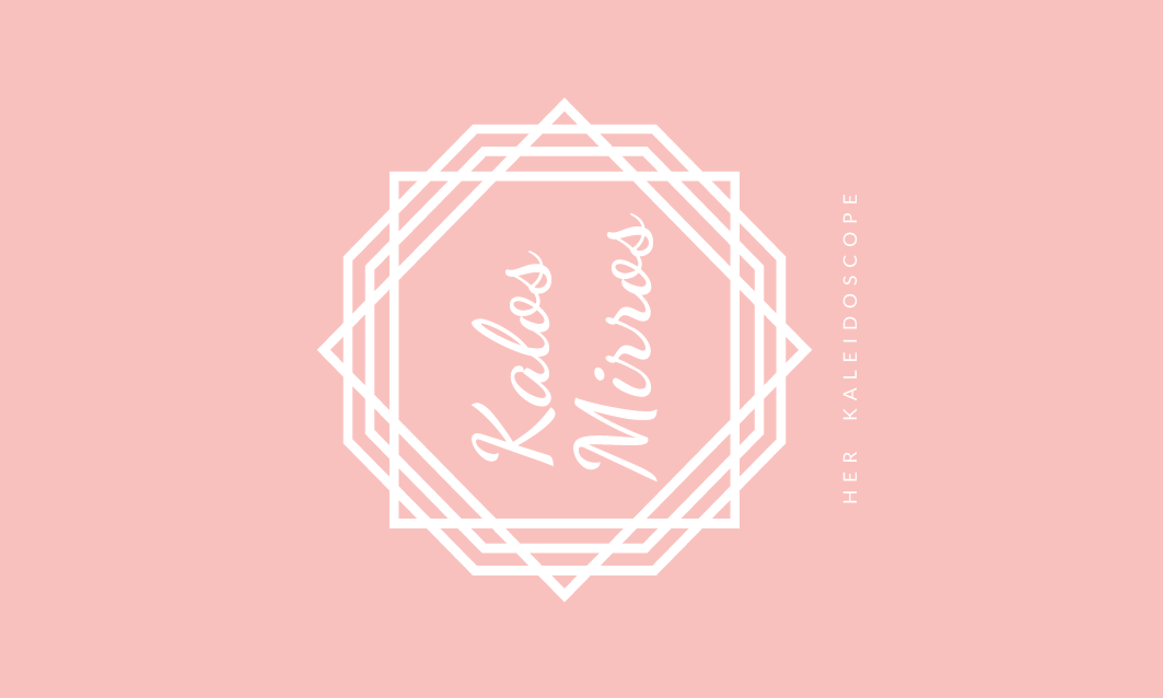
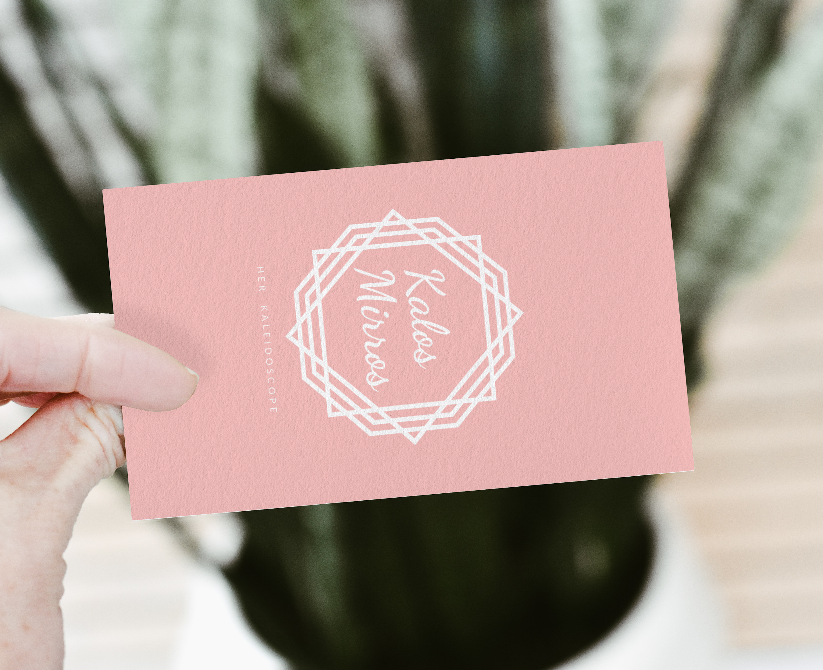
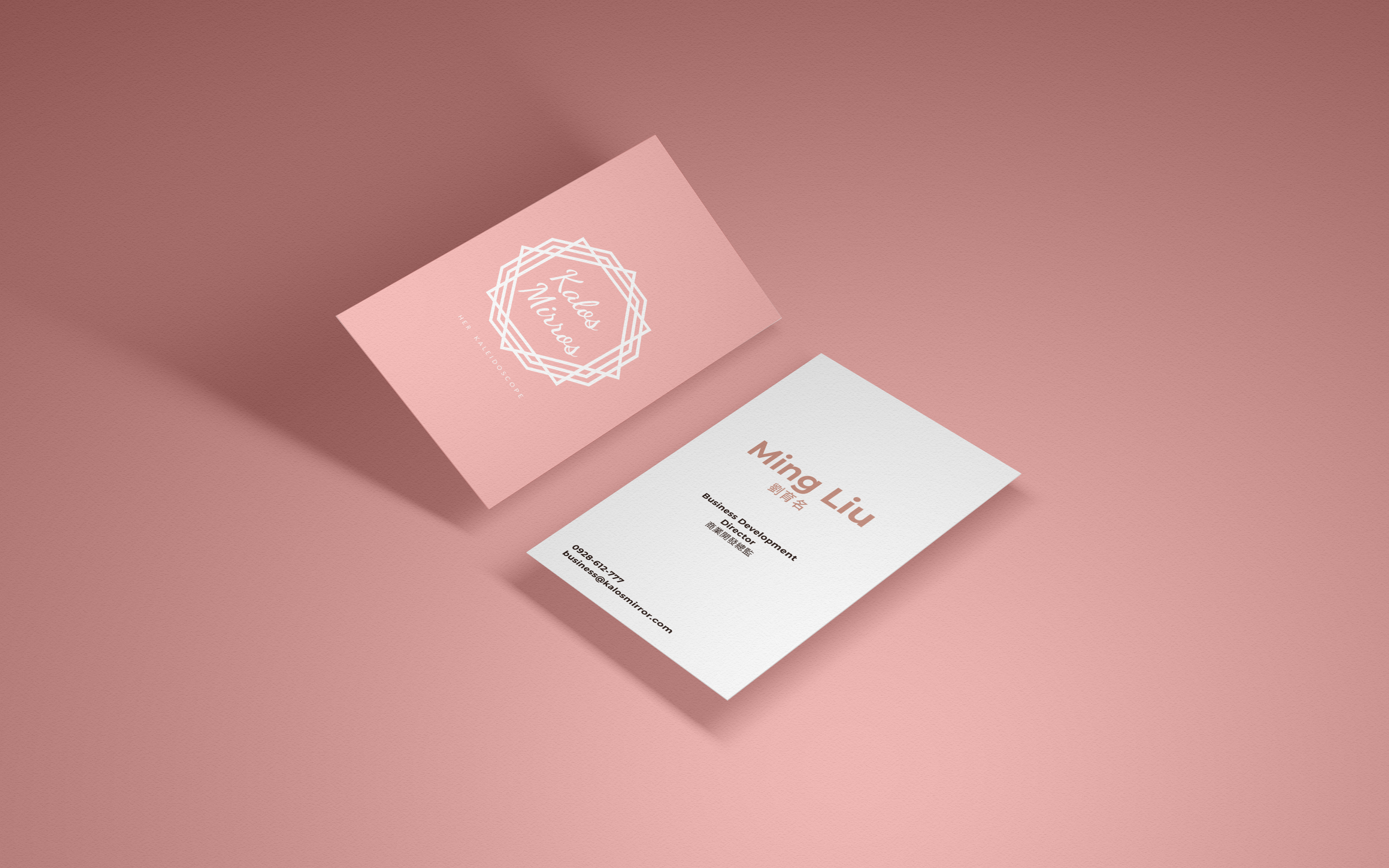
The wordmark is a soft script set on the diagonal, so the name itself feels light and personal. The frame around it is built from two squares, one sitting flat and one turned on its point, overlapped into an eight-sided shape that reads as a mirror.
That geometry is the idea in miniature. A mirror does not return one fixed reflection, and the overlapping facets stand for the many identities a woman might see when she looks. The mark is meant to hold all of them at once, and to feel empowering rather than prescriptive.
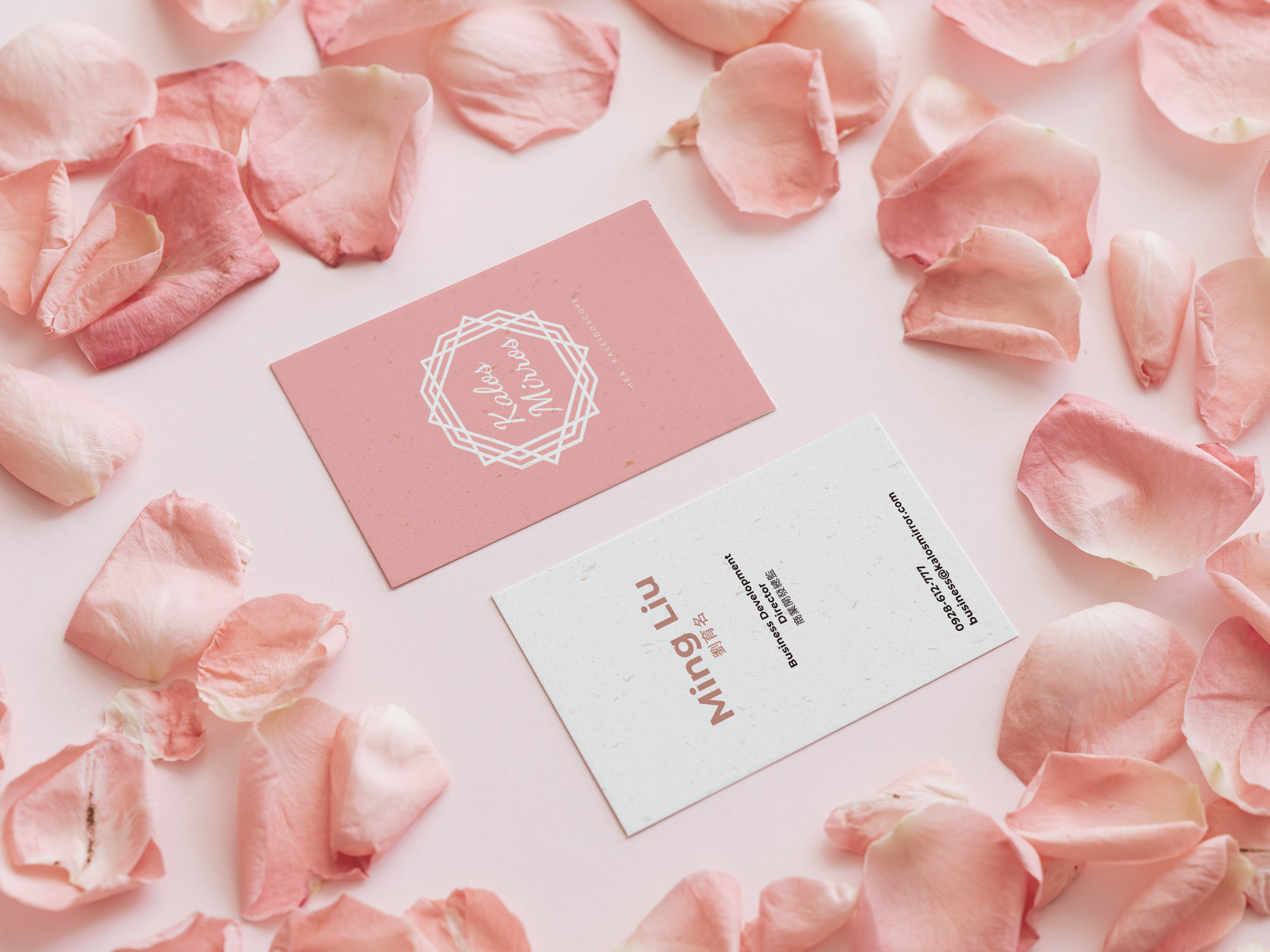
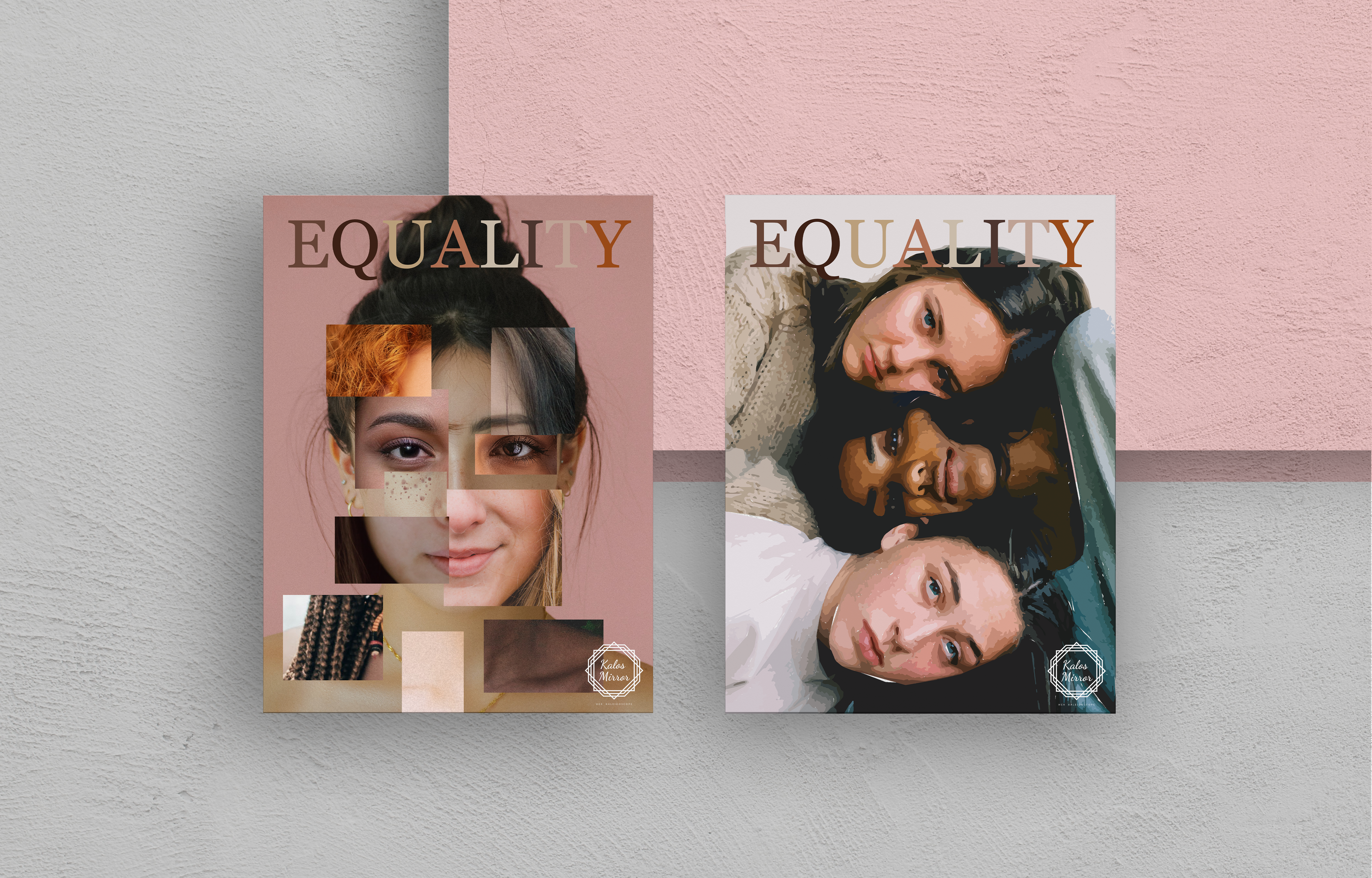
One palette, one mark, applied the same way on every surface so the card, the flyer and the wider identity read as a single brand.
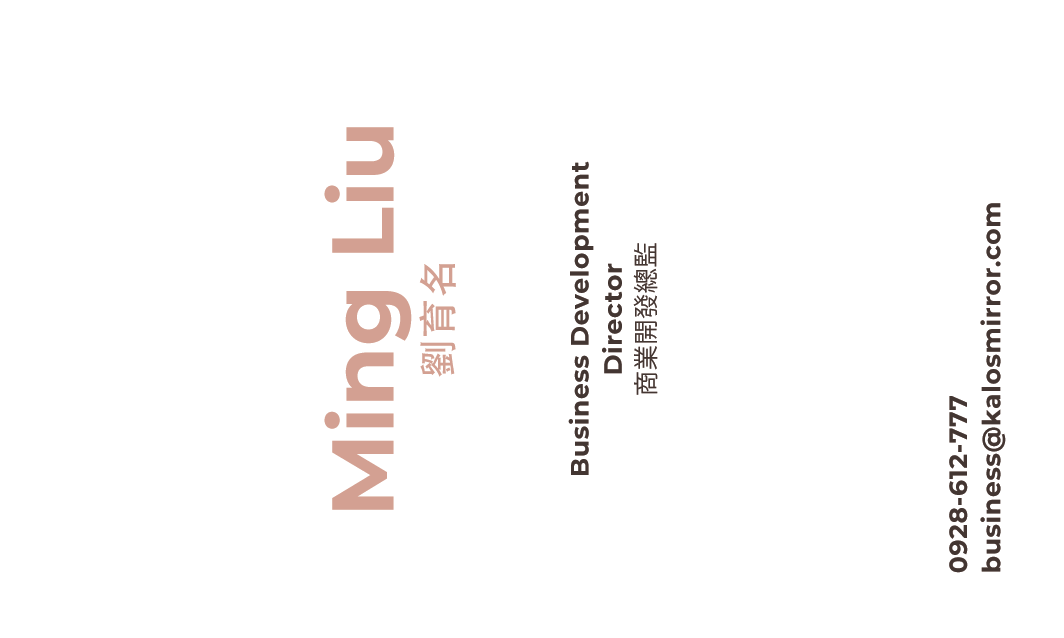
The front of the card carries bilingual details in English and Chinese, so the layout had to stay calm while holding two scripts at once. Generous margins and a clear hierarchy keep it legible in both, while the back is kept to just the logo and its English tagline, Her Kaleidoscope. The same restraint carries into the Equality flyer series, where the pink-led system stretches comfortably into editorial print.
nopqrstuvwxyz
0123456789