Corporate Map Generator
A small in-house web tool so any team can highlight its manufacturing locations on a region map and export a clean, on-brand image for slides, no designer, no software to learn, no off-palette guesswork.
Location maps were where the brand quietly fell apart, two different ways.
Teams made their own: screenshots from Google Maps, PNGs pulled off the internet, whatever was to hand. Every location map looked different, and none of them looked like the brand.
Even handing over Illustrator and Photoshop files only went so far, not everyone has the software or knows how to use it, and those who could would shade countries in whatever colour they fancied. Creative freedom is great; corporate work has to stay on brand.
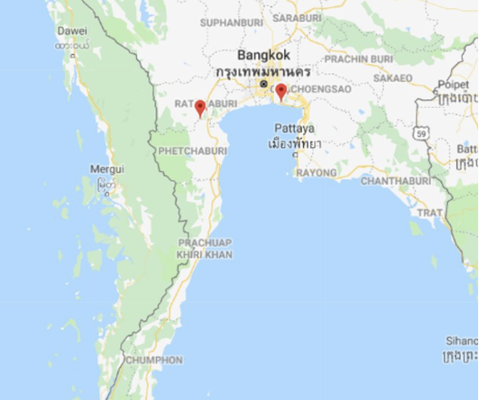
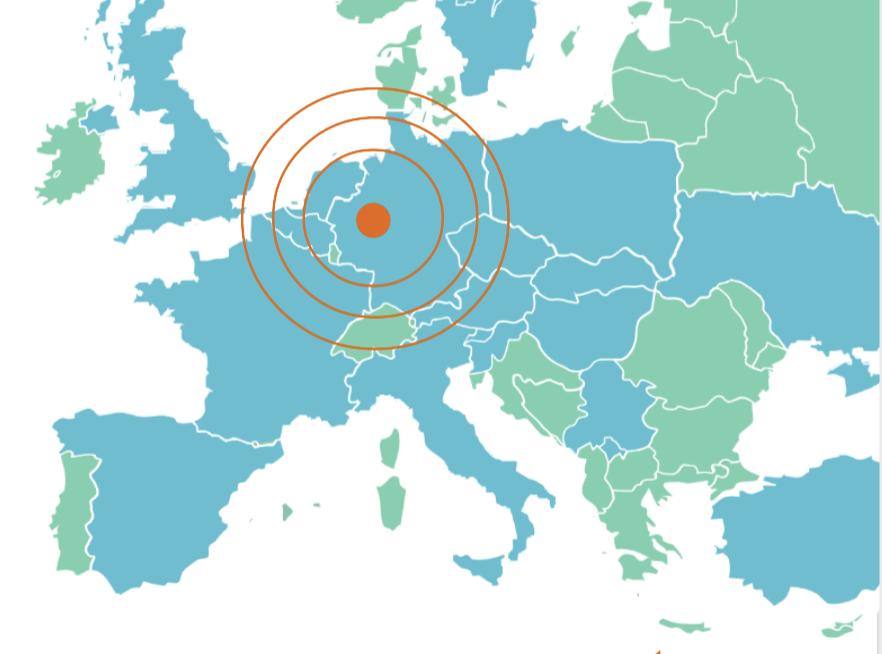
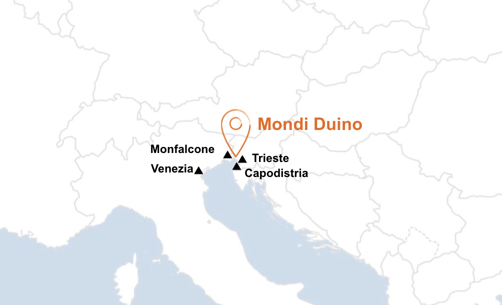
Marketing, sales and brand all reach for the same map for opposite reasons: speed, credibility and control. It has to hand each of them a finished, on-brand asset without a designer in the loop.



Remove the design decision entirely, rather than police it.
A style guide can describe the correct map, and a source file can provide one, but both still rely on the person at the other end having the right software, the right skills and the discipline to not improvise. At scale, across dozens of sites, that reliance is exactly where consistency breaks.
The tool flips it around. Instead of distributing files to be edited, it generates the finished asset, so there is no editing step to get wrong. The brand rules live inside the software, not in a document somebody has to follow.
The user makes the only two choices that should be theirs. Everything that carries the brand is decided by the tool.
Two decisions, both about content, never about styling.
None of these are exposed, so none of them can drift.
The map opens at the right proportions for that region, no setup, no design choices.
Each country fills in the brand green as you select it. Highlight as many as you need; zoom and pan to find them.
One click drops a deck-ready image into your slides, identical styling every time, no software needed.
It is deliberately lightweight: a single page, no dependencies, nothing to install. Real vector world geometry is drawn as inline SVG, one viewBox per region so each opens at the correct proportions, and countries highlight on click with live tags you can remove. Scroll zooms, drag pans, and North America can drop to US state-level fill.
Because every colour, border and label is applied from brand tokens in code, changing one in a single place re-styles every future export at once, no reissuing of files, no version drift.
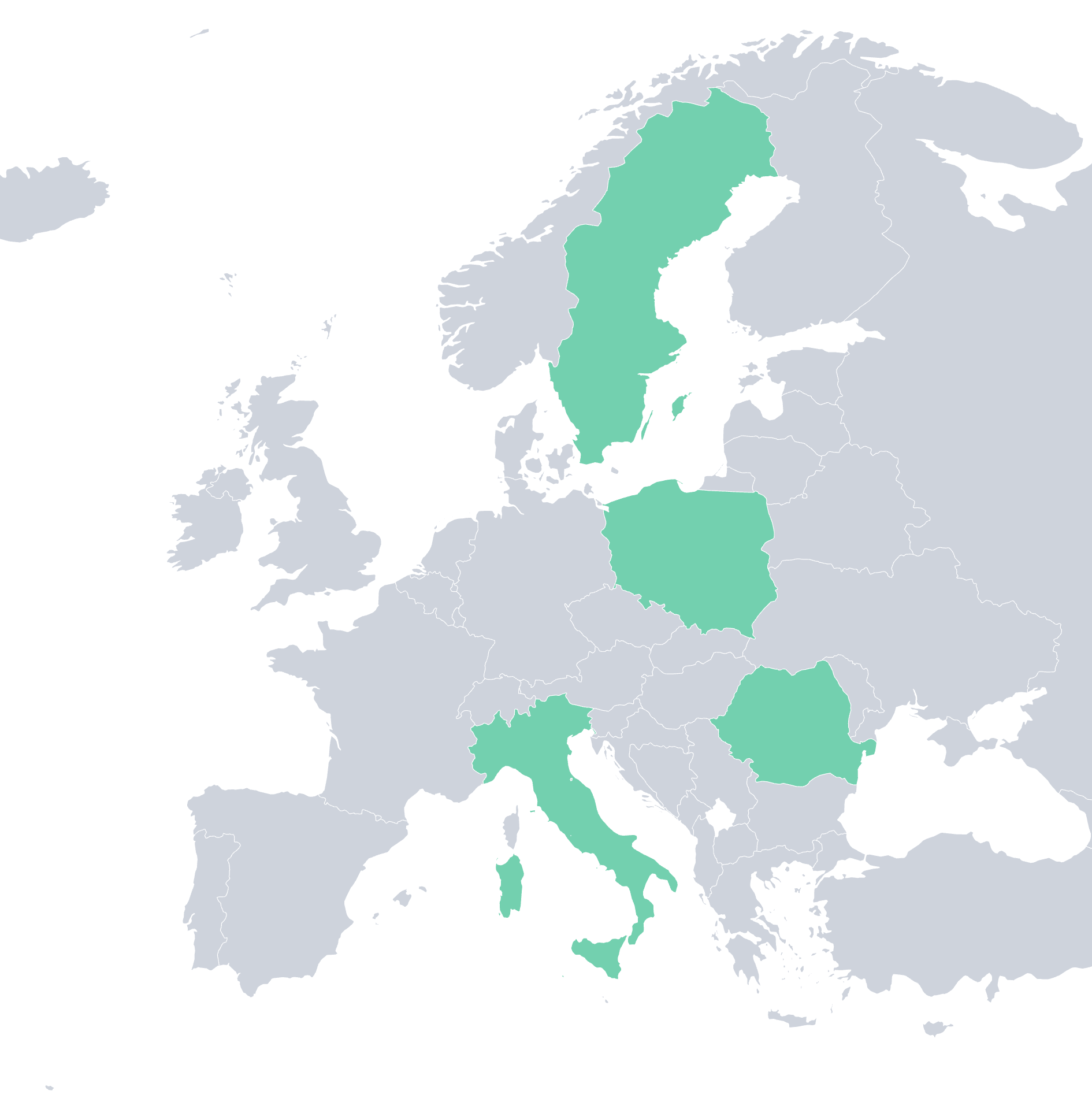
One click gives you a 3000 px PNG with a fully transparent background, so it drops straight onto any slide, in any brand colour, with no white box to crop or mask around.
The interface looks basic because it has to be. The people using it are not designers, and they should not have to learn another tool just to do their job. No menus to dig through, no settings to get wrong, no new system to adopt. If you can open a web browser and click, you can make the map. Every bit of effort went into the output looking right, not the tool looking clever.
It turns a design task into a two-click action: consistency at scale across every region, solved with a small piece of software instead of a style guide nobody reads. Good communications and good design are the same job, this is where they meet.
“This is exactly what I’ve been looking for.”
Early feedback from one of the site managers as the template was rolling out to teams. It is the whole point of the tool in a single line: the people who actually needed these maps could suddenly just make them, without waiting on a designer.