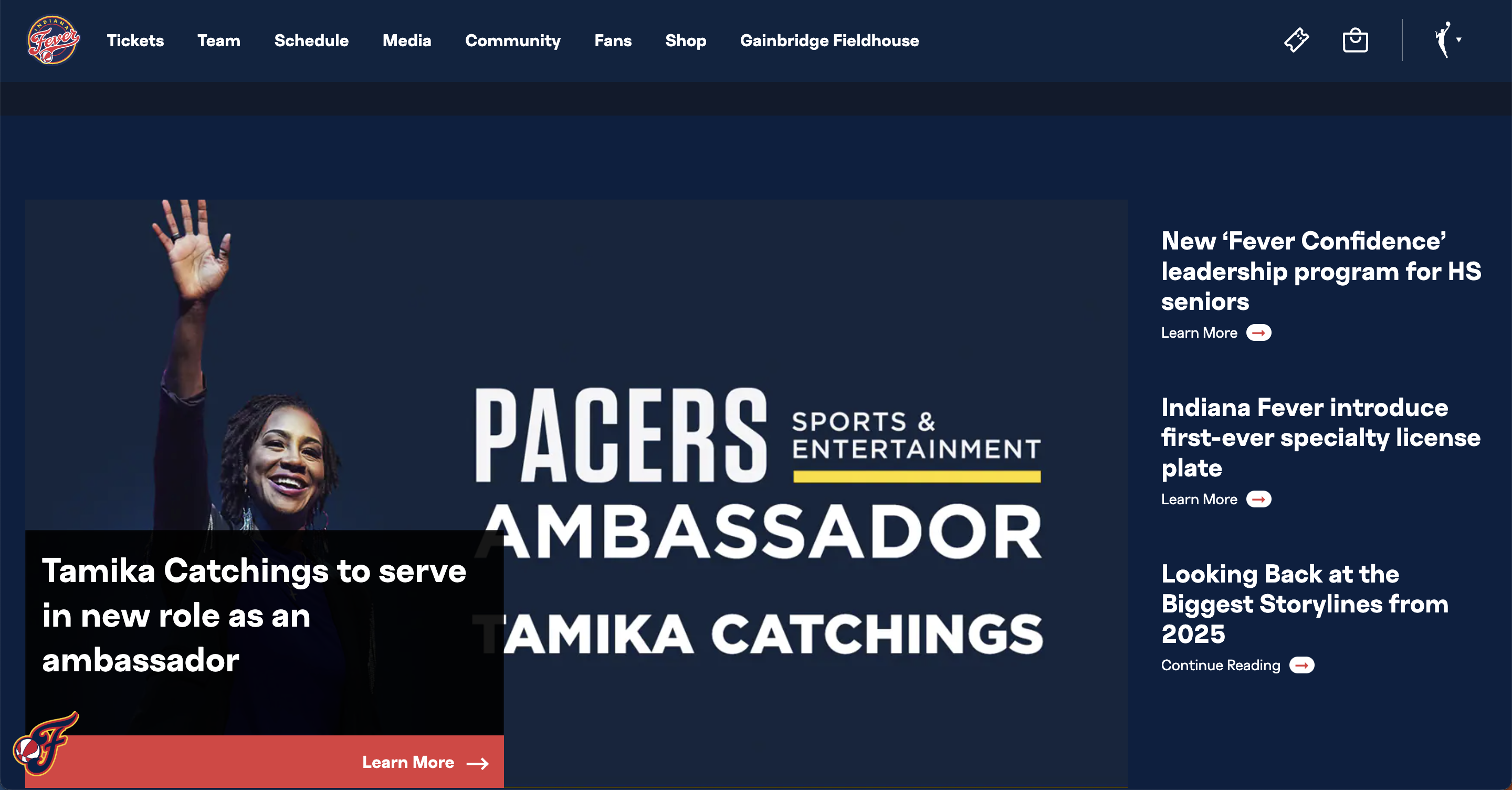
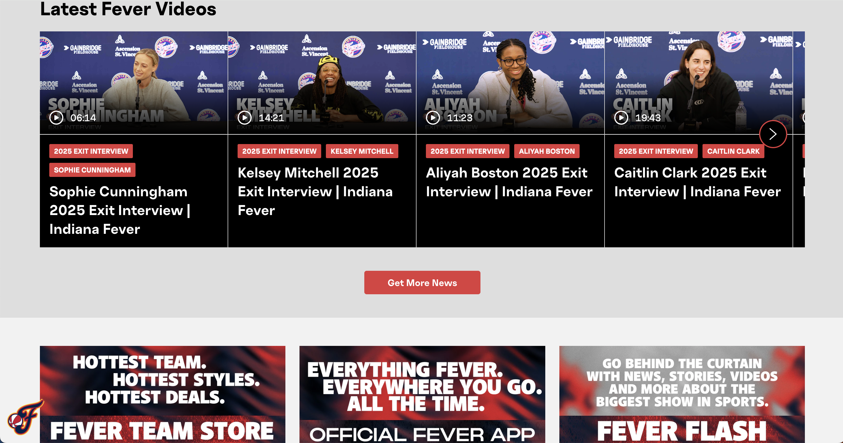
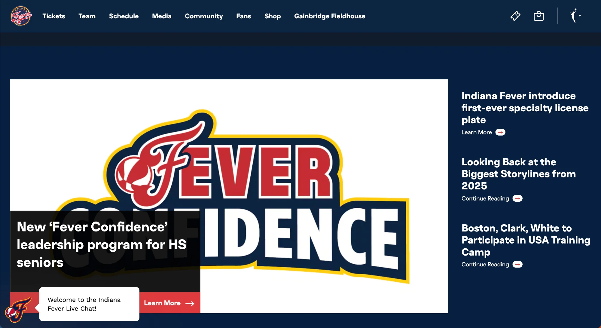
The official site treats fans like customers instead of community.
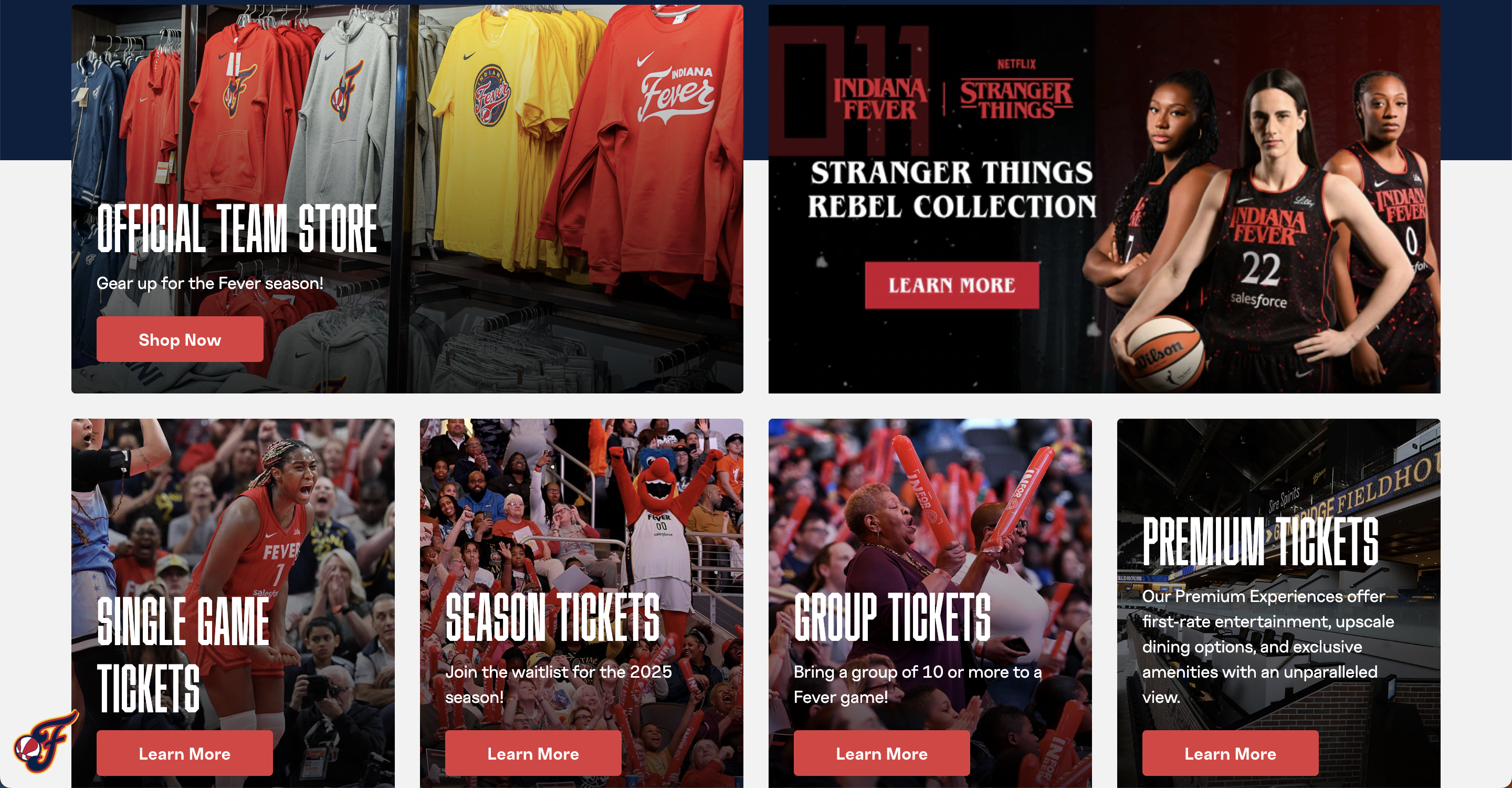
The current site leads with transactions: ticket sales, sponsor promos, app downloads. The Stranger Things collaboration, their biggest drop, sits in a plain thumbnail next to generic merch. Same size, same treatment, no excitement.
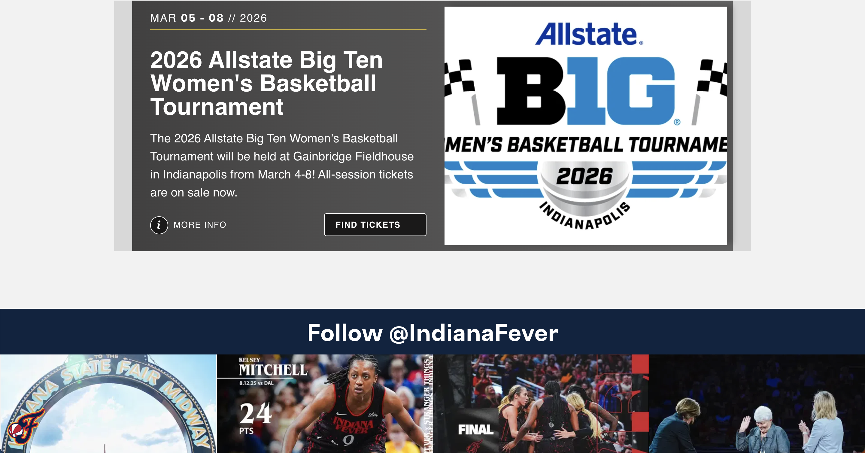
There's also a structural issue: the Fever page lives inside WNBA.com's shared template. One click and you're on another team's page. But a Fever fan isn't there for other teams, they're there for their team. The current structure treats loyalty as an afterthought.
Look at the biggest clubs in the world, Manchester United, Barcelona. Each site is built around the team's identity, colours, and story. What if Indiana Fever had that same brand ownership?
Fans don't visit a team site to be sold to. They come to feel connected.
Design goal: make fans feel like part of the team at every scroll. A landing page isn't a list of features, it's a story, where each section earns the next.
- Hero → hook. A looping highlight reel of crowd, huddles, and gameplay. You feel the energy before reading a single word.
- News → context. Hover-activated cards keep fans informed. You're not an outsider; you know what's happening.
- Schedule → anticipation. A live countdown to the next game. Now you're waiting for something.
- Starting Five → connection. Animated player cards with click-to-reveal stats (PPG, RPG, APG). Inspired by NBA 2K's team-select screen, fans meet the players in 10 seconds, no navigation required.
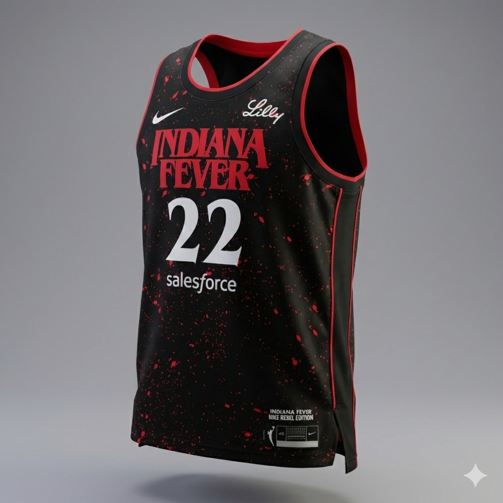
- Shop teaser → desire. A 360° spinning jersey floating in darkness with the Stranger Things aesthetic. The drop becomes an experience, not a CTA.
A limited-edition collab is a moment. The goal was to make fans stop and feel something, not scroll past another thumbnail. So the drop got the sneaker-launch treatment: a 360° spinning jersey floating in darkness, wrapped in the Stranger Things aesthetic. The Upside Down reaches Indiana before anyone clicks buy, turning a flat CTA into an experience.
The catch: the only source material was the official site's flat front and back PNGs. Getting from there to a cinematic spin took a four-step pipeline.
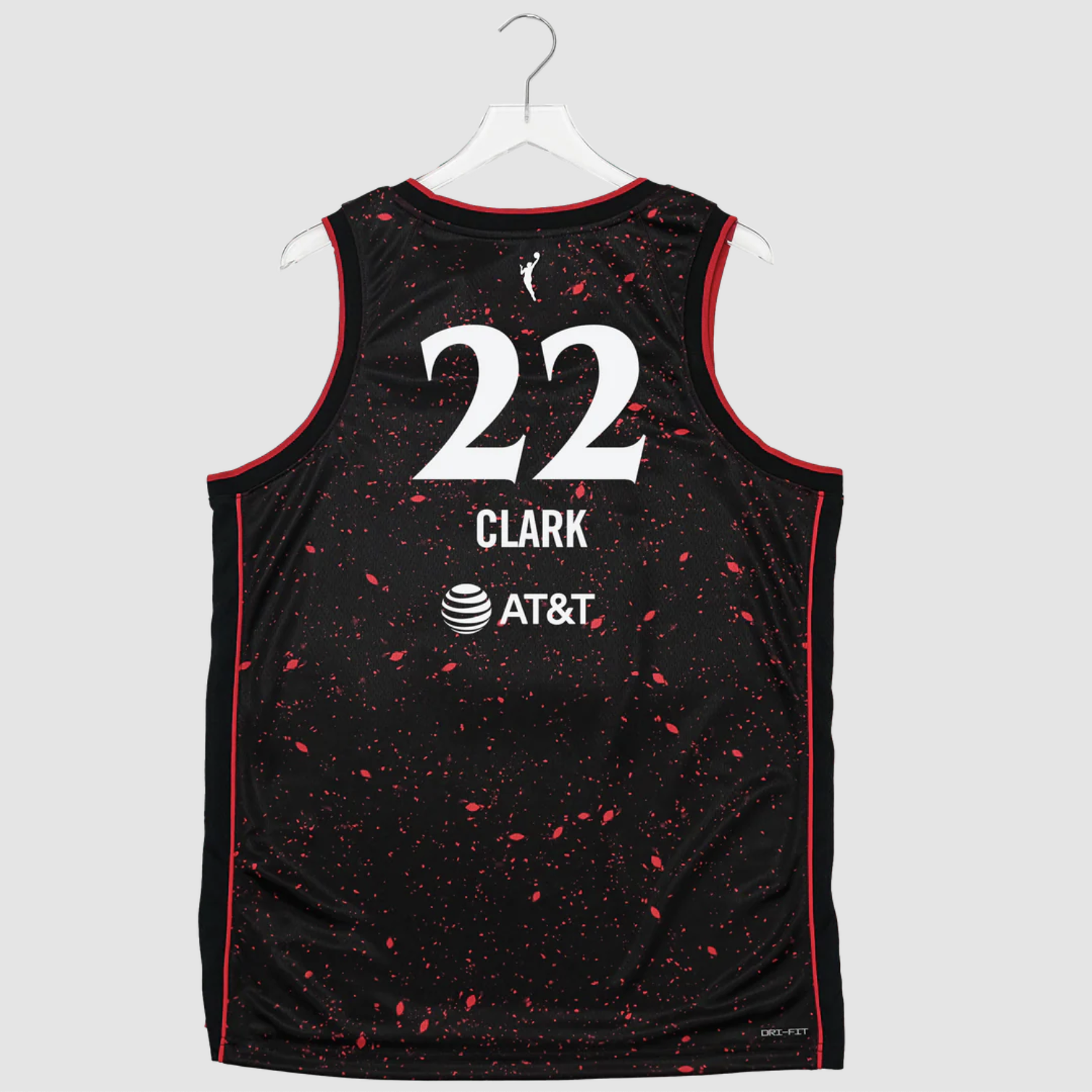
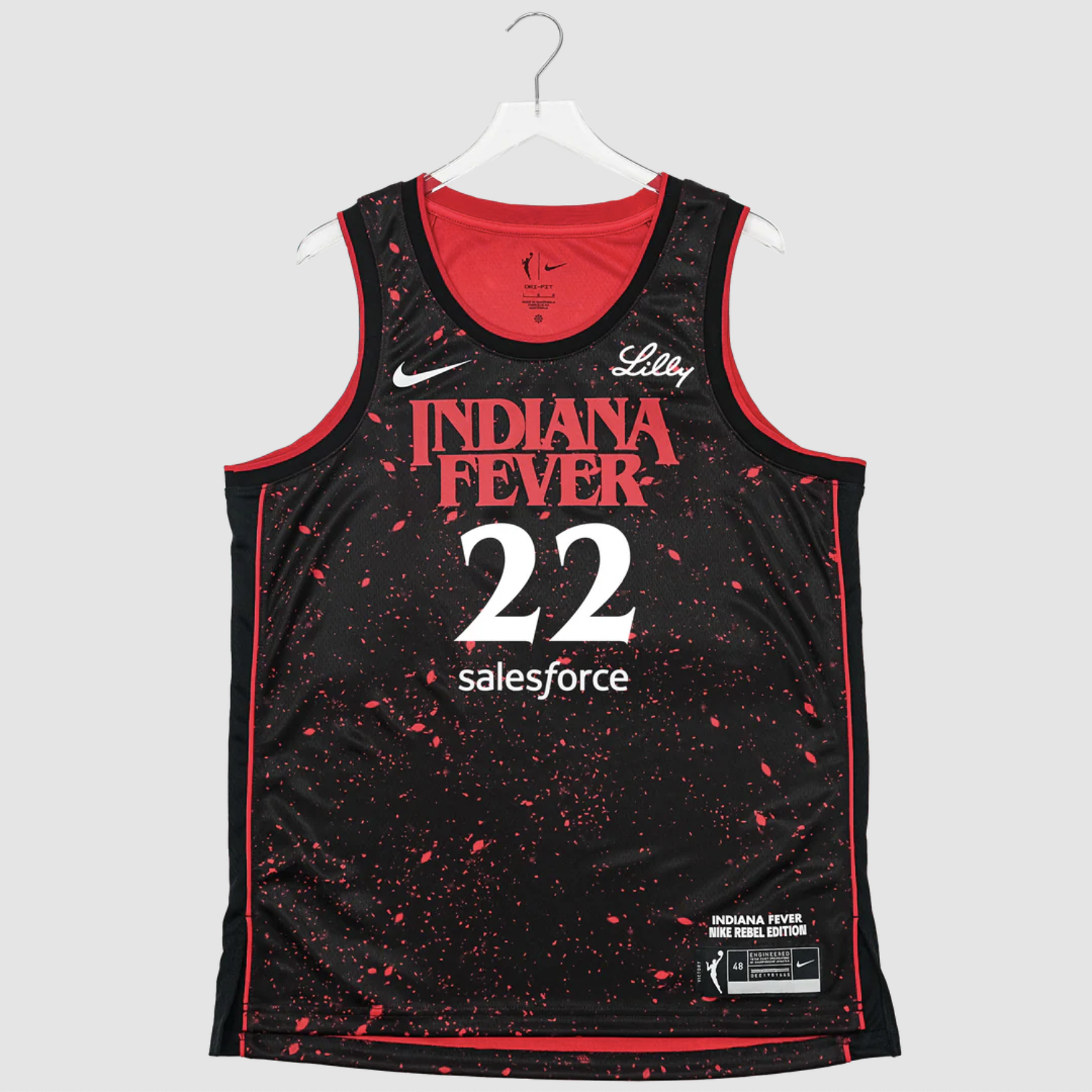 Tap to flip ⇄
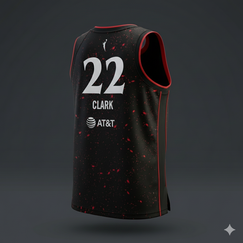
 Tap to flip ⇄
- Usability testing with real Fever fans across all three personas.
- A/B test the cinematic shop teaser against a traditional product grid.
- Measure scroll depth, time on page, and click-through to shop.
- Lead with emotion, not transactions. The official site opens with a promo; this opens with energy.
- Players are the product. Front and centre, not buried in a submenu.
- Scarcity needs staging. A limited collab deserves a moment, not a thumbnail.
- Less content, more impact. One story, one action per section.
The official site sells tickets. This redesign builds a fanbase.