The fitness industry can feel intimidating, especially for women just starting out.
Kalos Mirror wanted a digital space that felt encouraging rather than competitive, focused on self-discovery and personal growth instead of metrics and comparison. The challenge was working within a startup's earliest exploratory phase, where the vision was still evolving, and translating abstract values like confidence and safety into concrete visual language.
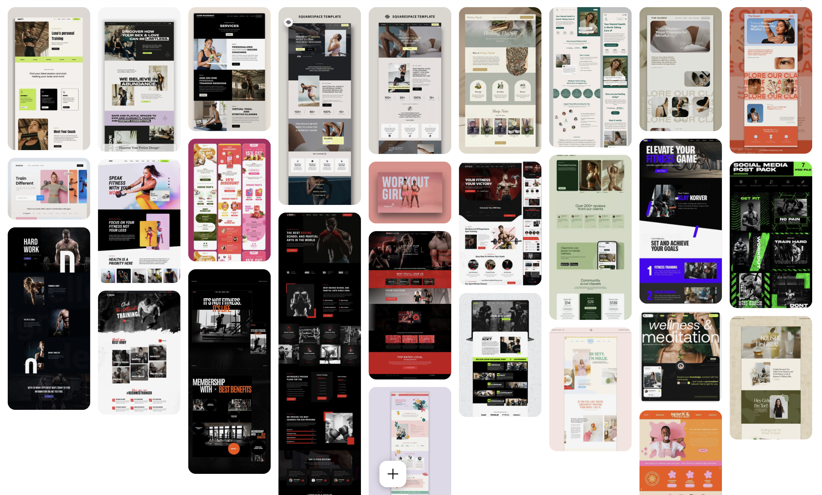
With the brand direction still undefined, I gathered visual inspiration from Pinterest and Dribbble to understand the range of possibilities. This helped the team articulate what resonated and what didn't, eventually leading to two distinct directions worth exploring further.
I created and prototyped both concepts in Wix, using native animations to convey tone and interactivity, a way to help the team visualise the platform's potential.
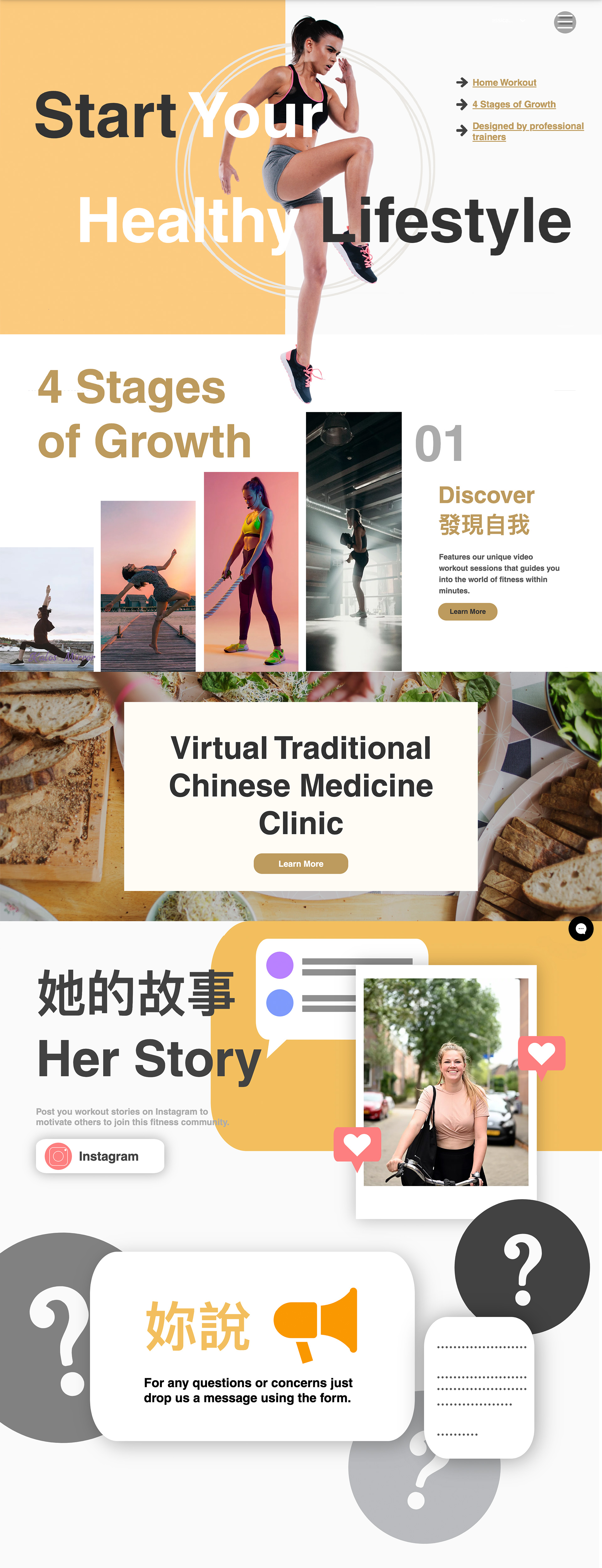
A soft, inviting experience using warm pastels, rounded cards, and gentle animations. It leans into curiosity and comfort, with playful layouts and uplifting microcopy to make fitness feel friendly and approachable.
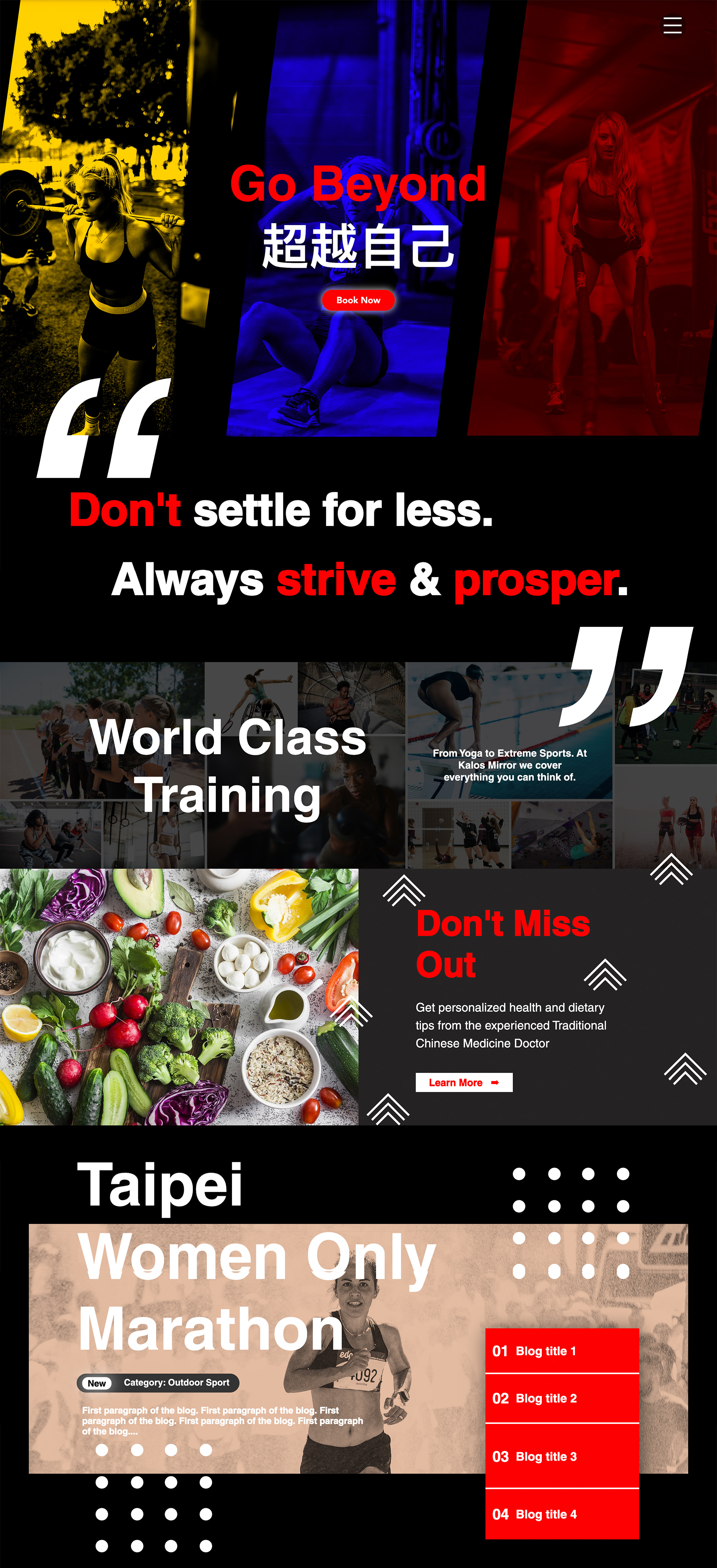
A confident, action-driven layout with high contrast, clean lines, and bold typography. The structure is goal-oriented, with clear sections, sharp CTAs, and dynamic visuals to motivate users ready to take charge.
Sometimes the value isn't a final product, it's helping stakeholders see possibilities.
This was my first time designing for a startup in such an early stage. The two contrasting directions gave the team something concrete to react to, which is often more useful than abstract discussions about "brand feel."
Even though Kalos Mirror didn't continue, the project taught me how to work with ambiguity and turn vague ideas into tangible options.