A full logo exploration for Miss Warrior (勇士伽人), a women's yoga brand by Natalie built to grow confidence and strength on the mat. Sixteen routes across four directions, working toward one mark that could feel like a warrior and a calm morning at the same time.
Role
Logo & identity design
Tools
Illustrator, Photoshop
Client
Miss Warrior / Natalie Yoga
Scope
16 concepts · 4 directions
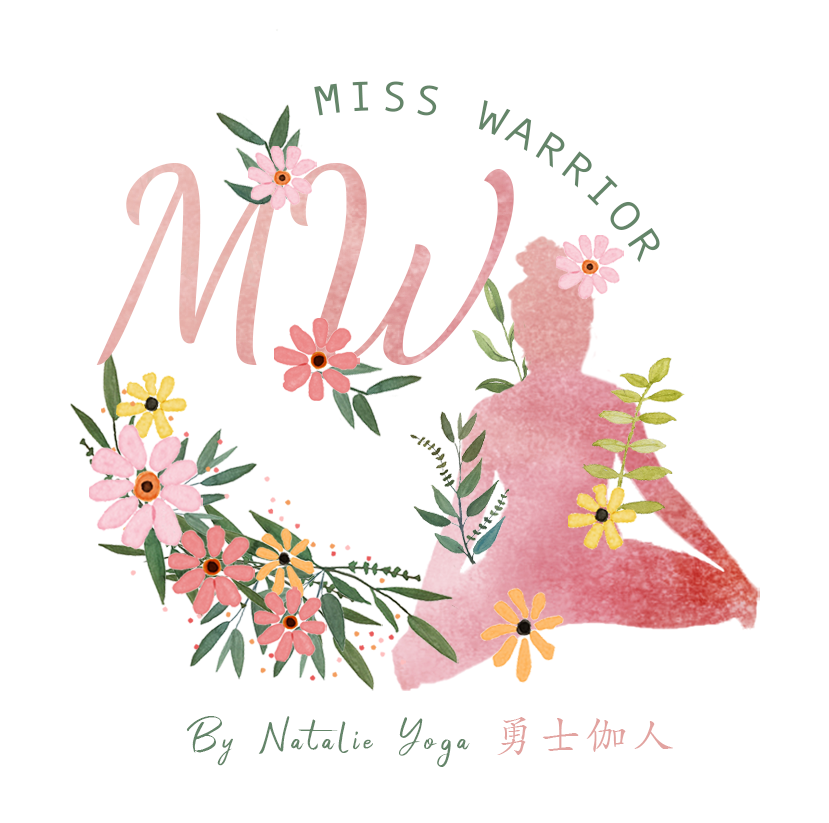
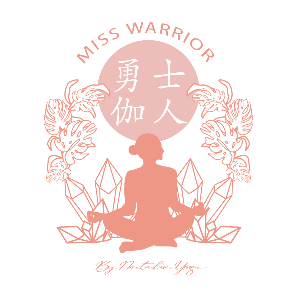
The final mark. An MW monogram, a seated figure, a wreath of wildflowers, and the brand name set in both English and Chinese.
The brief
What the mark had to carry.
Miss Warrior sets out to grow women's confidence and strength through yoga. The name pulls in two directions on purpose: "warrior" asks for power, "Miss" and the practice itself ask for grace. The logo had to hold both, stay legible at thumbnail size, and read to a bilingual audience. Each round below works a different balance of those forces.
Elements the client asked for
The name, twice
"Miss Warrior" and 勇士伽人, with "By Natalie Yoga"
A woman, mid-practice
Lotus, dancer and warrior poses all on the table
Warrior cues
A crown, a star, arrows, a rising sun: strength without aggression
Softness to balance it
Watercolour, wildflowers, monstera, a warm blush palette
An MW monogram
Able to stand on its own for avatars and stamps
Range
One identity that works on a profile picture, a mat label and a flyer
01
First explorations: finding the warrior
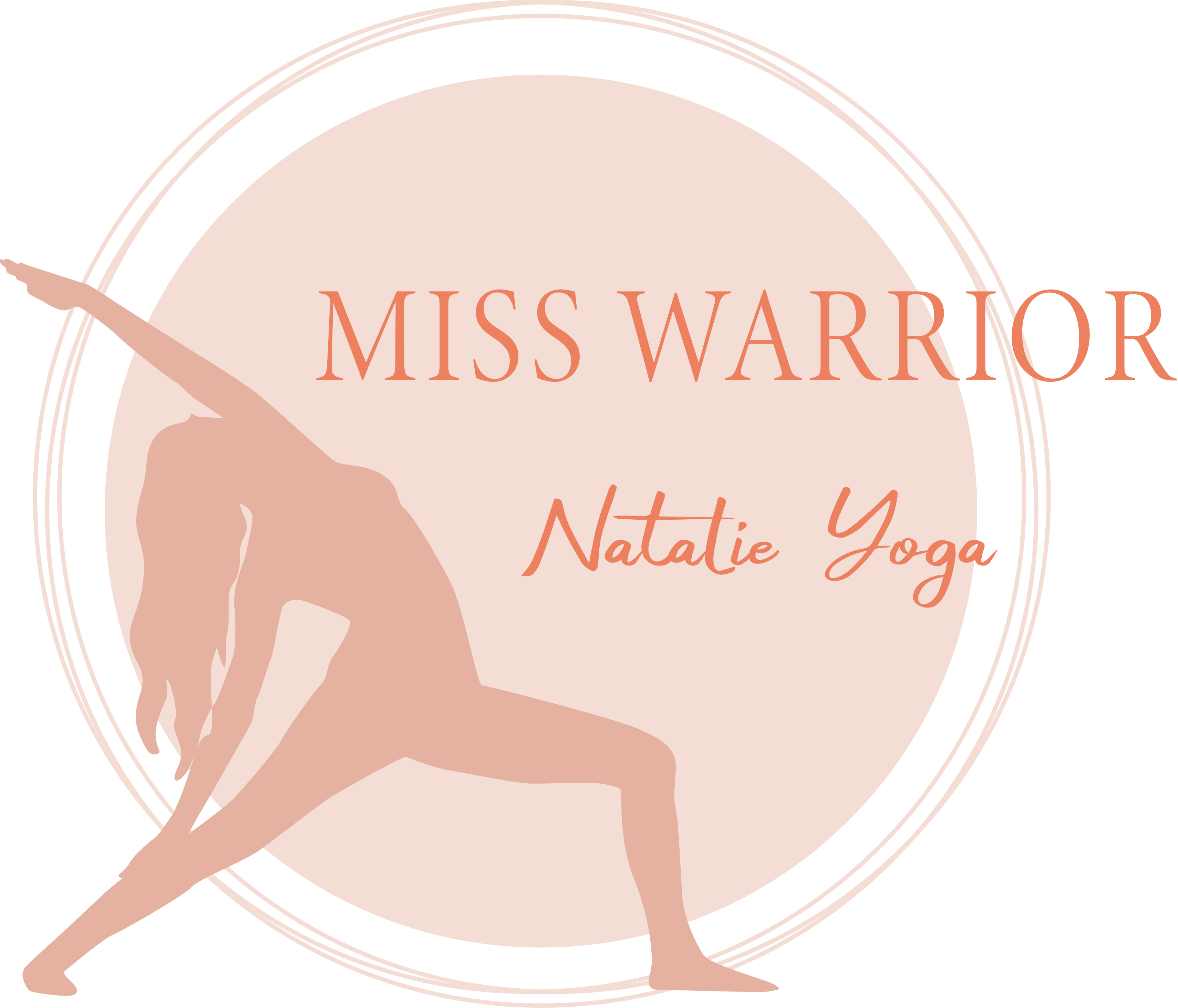
The first round took the brief literally. If she is a warrior, what does that look like? These studies tried a portrait of the woman herself, a crown and a star borrowed from a more obvious kind of hero, and a couple of vintage stamps that leaned athletic.
Seated study. A single continuous line, no name treatment yet.
Portrait route. A calm three-quarter figure with a soft script.
The crown. A star tiara to say warrior out loud.
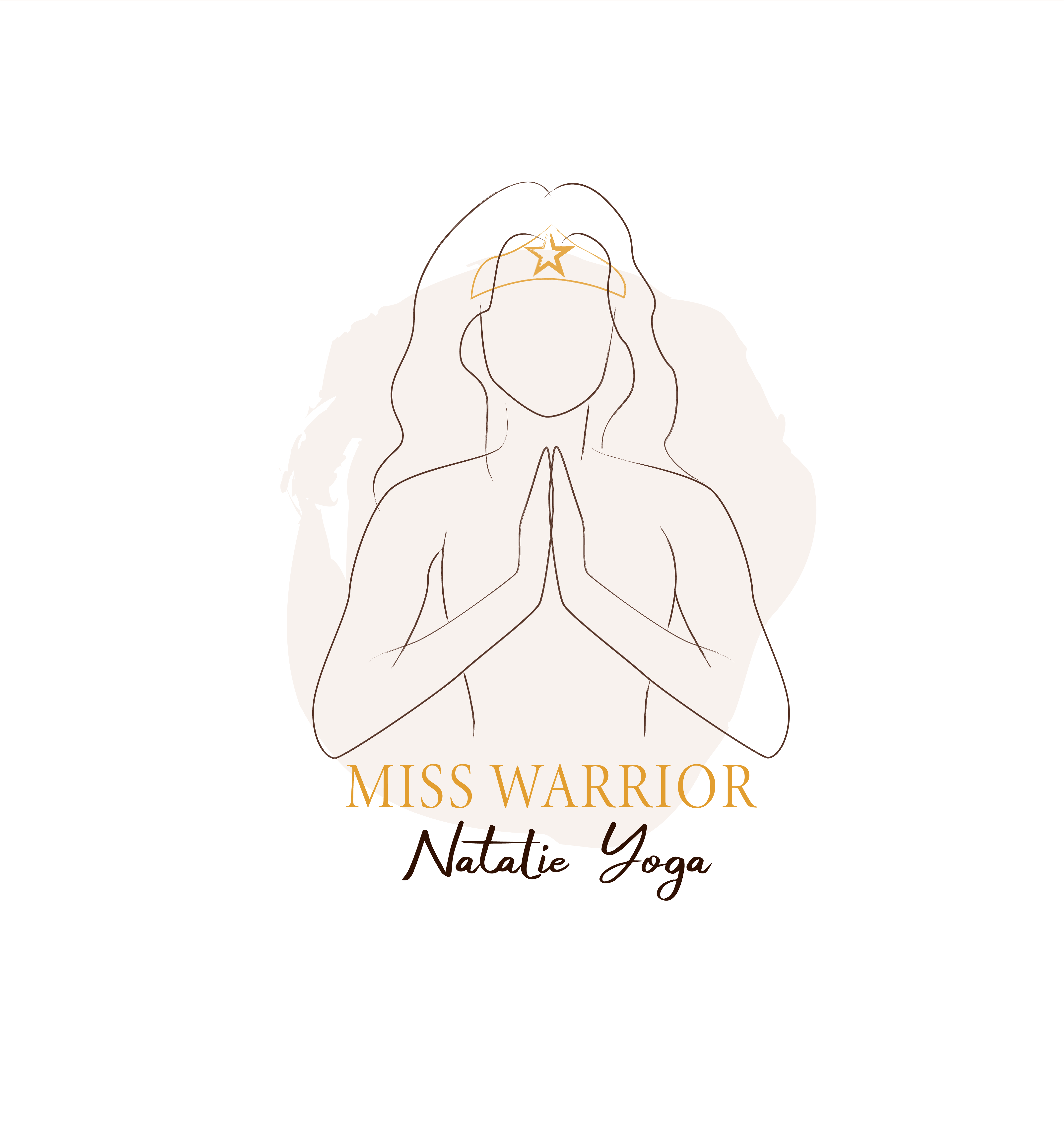
Prayer hands and crown. Strength meeting stillness.
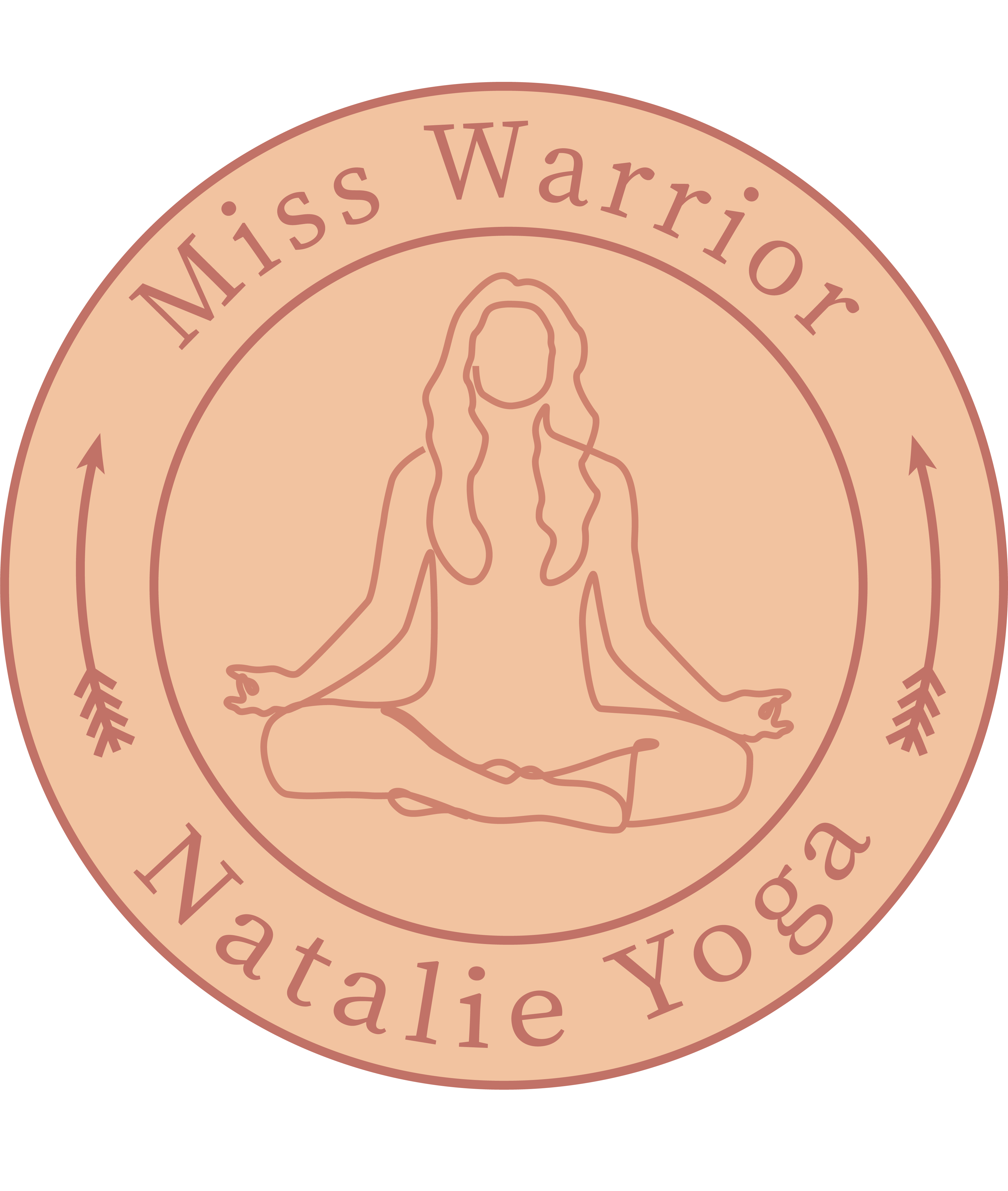
Terracotta stamp. Lotus pose framed by arrows.
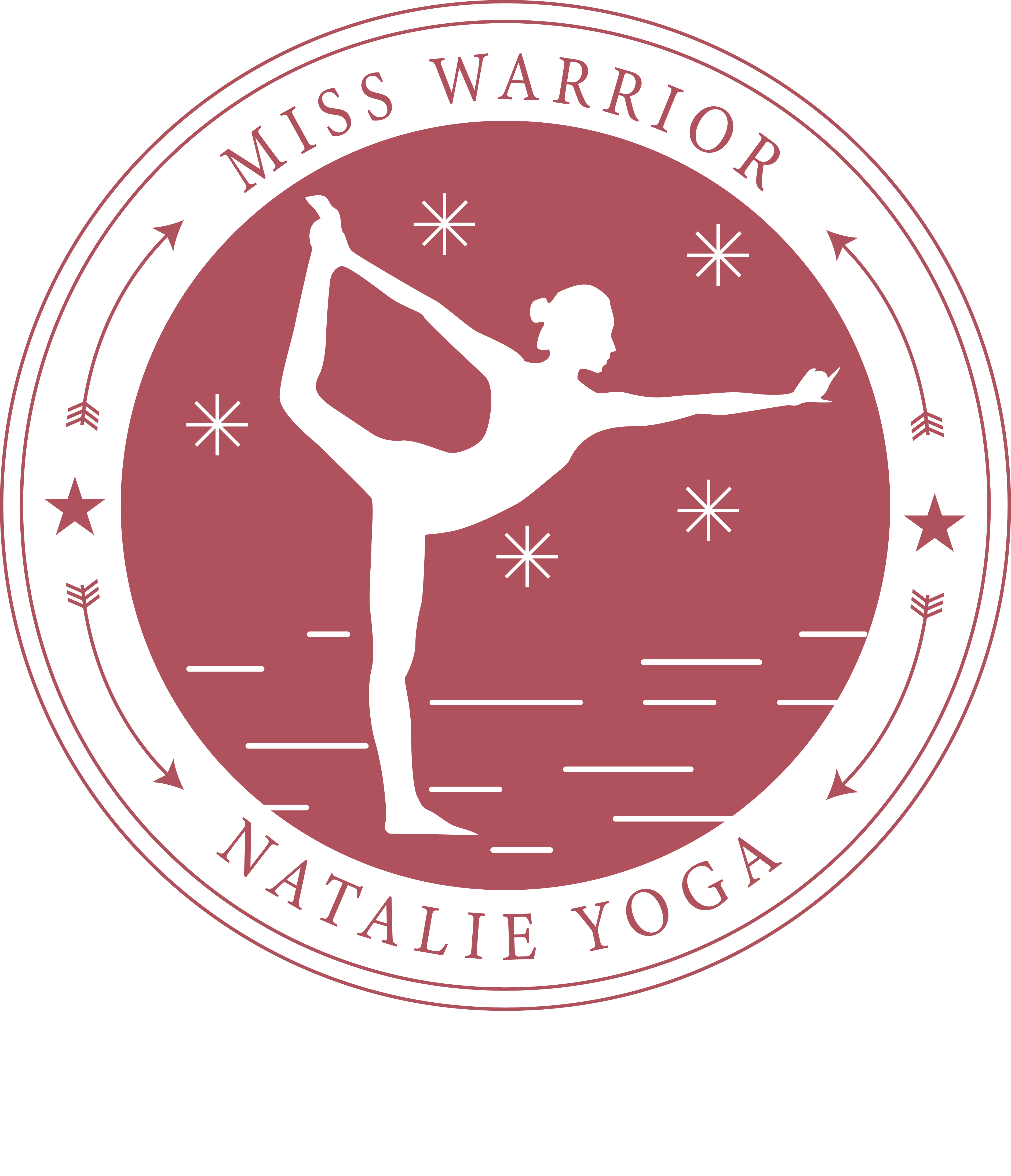
Athletic emblem. Dancer pose, stars and speed lines in a badge.
02
Emblem studies: one woman, one circle
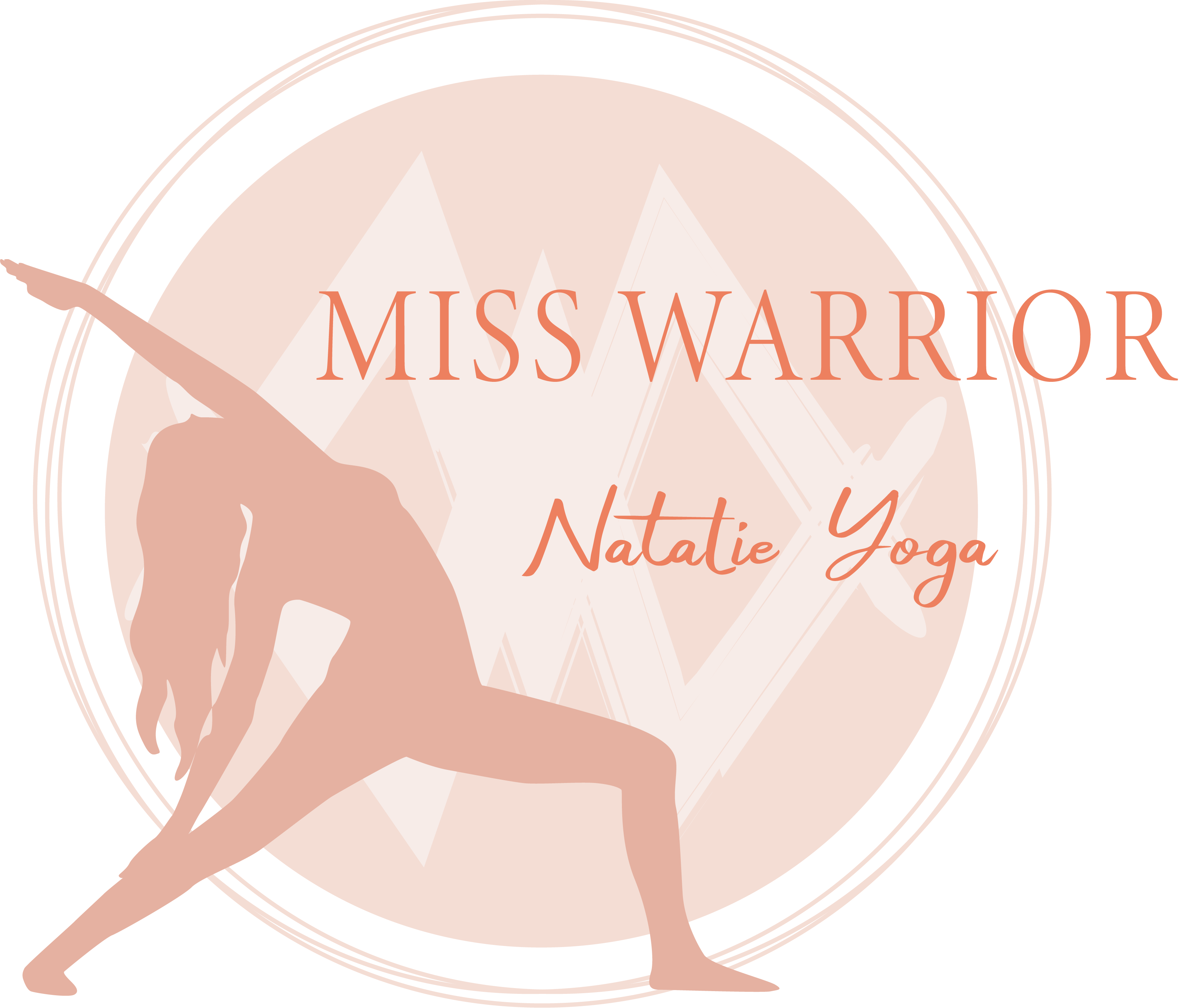
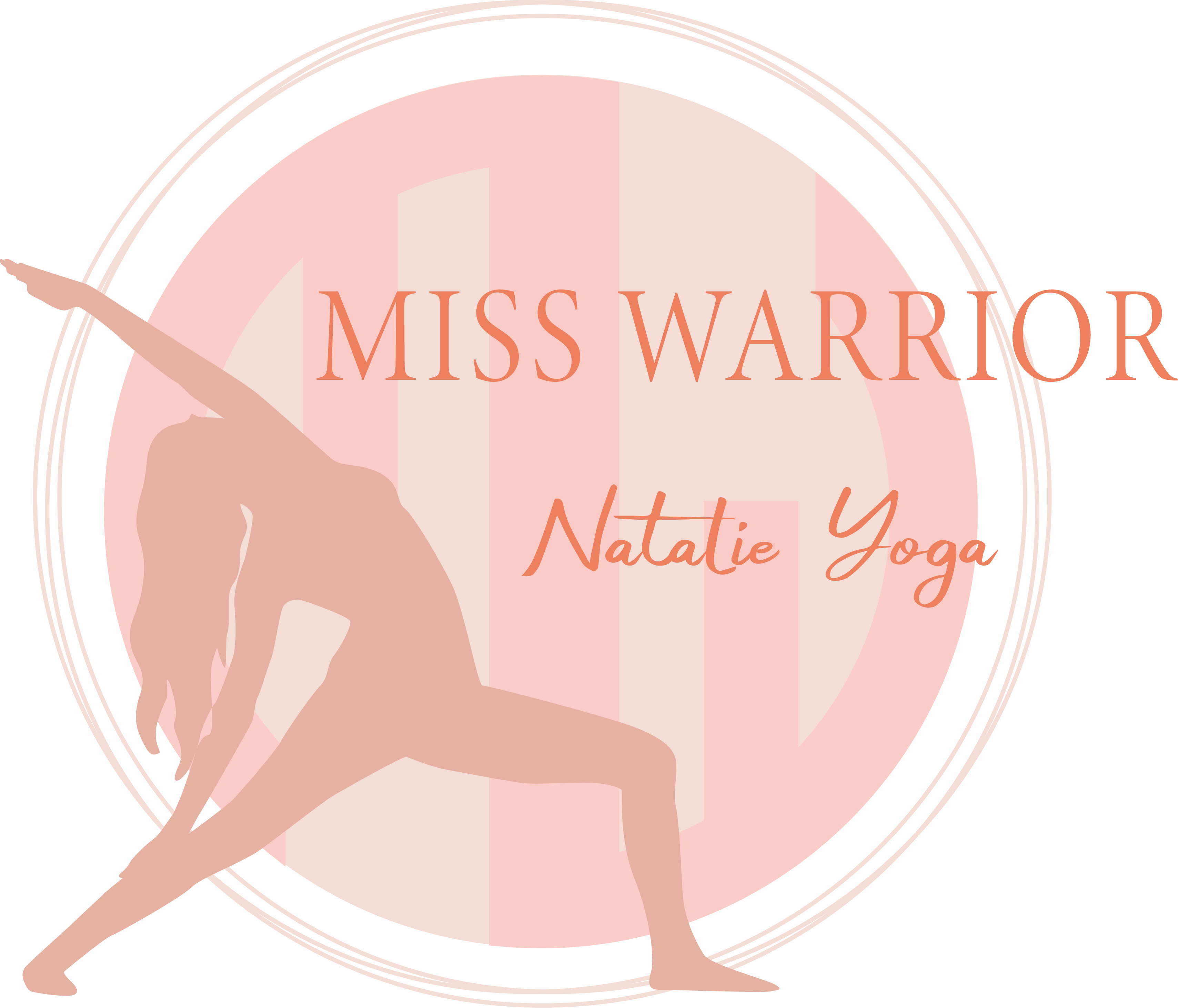
The badge idea was worth pushing on its own. Each of these keeps the same recipe, a single figure inside a hand-drawn ring, and swaps the pose and the backdrop to test how much personality the silhouette alone could hold.
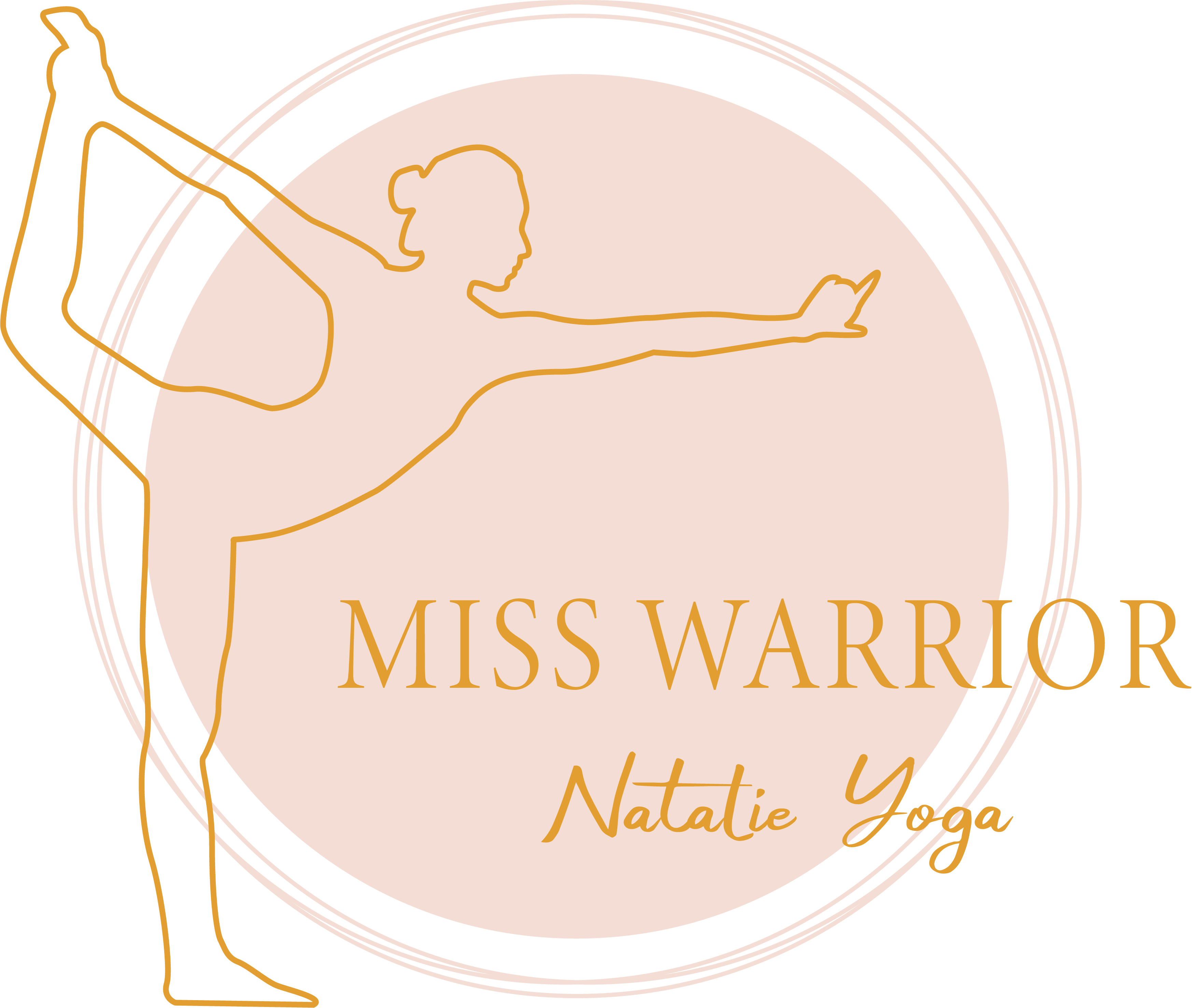
Dancer pose, open line. Light and airy.
Triangle pose, filled silhouette. More grounded.
Same pose, MW behind. First time the monogram appears.
And again, soft columns. Testing the backdrop texture.
03
Going bilingual: line and leaf
This is where the brand found its voice. The Chinese name 勇士伽人 came in, the palette settled into coral, and the warrior softened into clean single-line poses wrapped in botanicals. Crystals, monstera and roses each got a turn.
Crystals and monstera. Meditation pose, grounding energy.
Sunburst and roses. Warrior pose under a rising sun.
Rose and monstera. The lightest of the three.
04
The final marks: watercolour MW
The chosen direction brought it all together. A hand-painted MW monogram, a figure mid-flow, a wreath of wildflowers, a warm sun, and the name in both languages. Three finished lockups give Natalie a hero mark plus simpler versions for smaller spaces.
Sun and full wreath. Warrior pose with a green script.
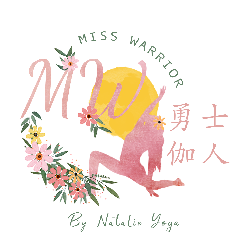
Monogram lockup. MW with the warrior figure and sun.
Final direction Where it landed. Lotus, monogram and a complete floral wreath, the version the work built toward.
A note on outcome. This was an early freelance exploration that wrapped before a launch was confirmed, so whether this exact mark went live is unknown. It is shown here as a design exercise, a record of pushing one shape from rough sketch to a strong, soft final, not a claim of a shipped brand.
The takeaway
A logo is a compression problem. Everything a brand believes has to survive being shrunk to a thumbnail and still read at a glance. The hard part here was never drawing a warrior or drawing a flower. It was getting both into one shape, so the result feels strong and soft at once, the way the practice itself is meant to.